ファイルボックスプロダクトデザイン、ネーミング開発、ブランディング
当社は、ファイルボックスのプロダクトデザイン、ネーミング、ロゴデザイン、ブランディングなどを担当しました。当社がネーミング開発した「Theodorus」は、最先端の技術を用いて、航空宇宙部品などの精密部品加工を行うクライアント企業である「S-TEC Inc.」が展開するステーショナリーブランドです。
「Theodorus」は、西洋美術史において最も有名で影響力のある画家、フィンセント・ファン・ゴッホを生涯に渡り精神的・経済的に支え続けた弟の名。兄フィンセントにとって、それは、地球にとっての月のように、極めて密接で重要な存在であったに違いありません。時には影でビジネスを支え、時には主役となってインテリアに花を添える本製品の役割は、テオドルスのフィンセントに対するそれと重なります。
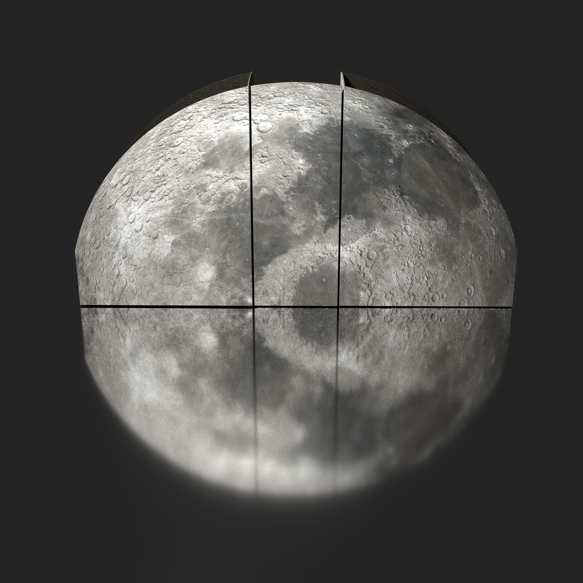
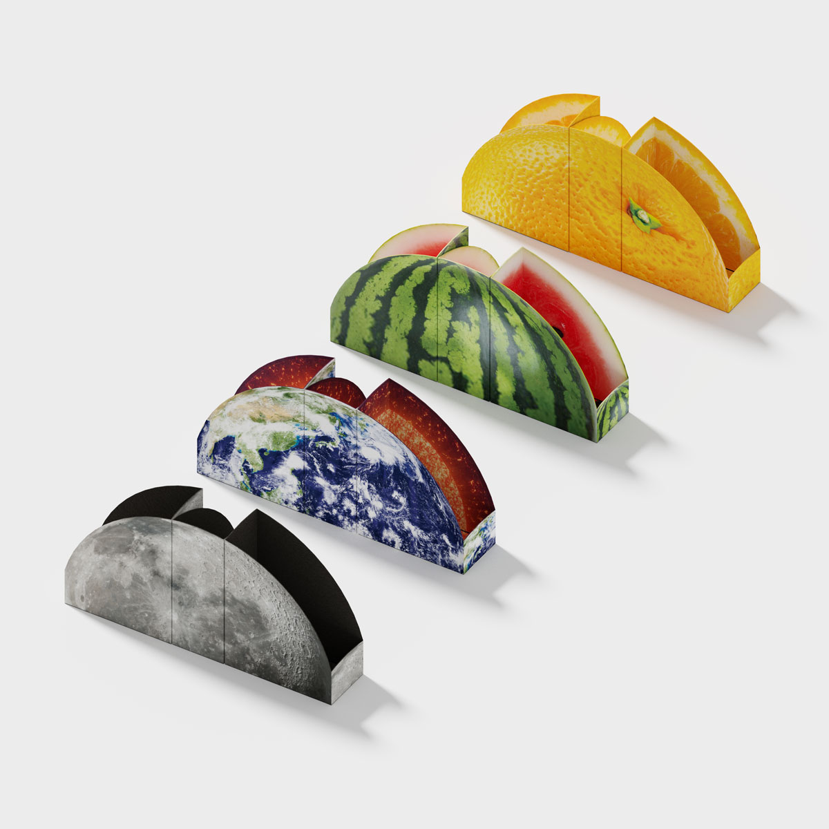
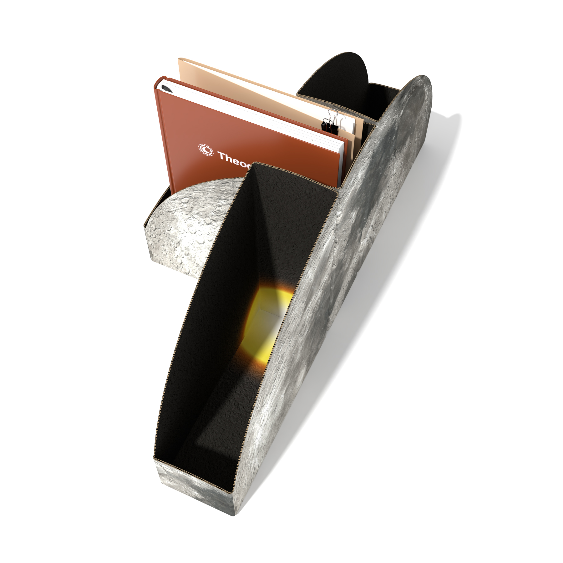
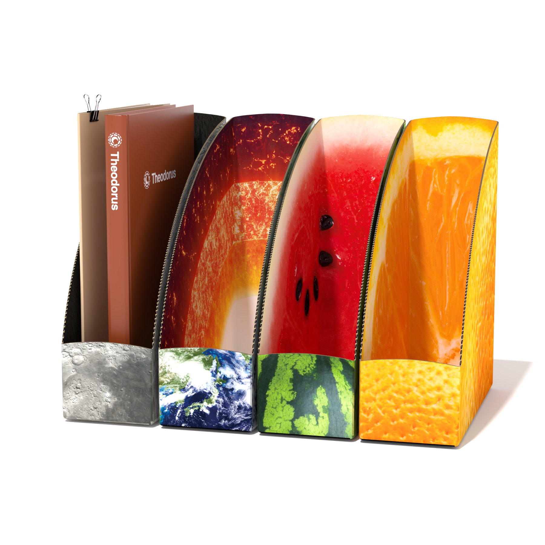
このファイルボックスは、3個並べると半円形となる特殊な形状で、かつ、中面にも印刷を施すことで、これまでに類を見ない革新的な商品となっています。私たちの調査では、段ボールを使用したファイルボックスで、半円形の形状のものや、表裏の両面に印刷が施されたものは存在しませんでした。商品には、ブランドを代表する宇宙シリーズの月と地球、フルーツシリーズのスイカとオレンジの合計4種類があります。これによって、航空宇宙産業に携わるクライアント企業の事業内容とリンクさせており、シンボルマークにも、ゴッホの代表作のひとつである「星月夜」に描かれた月をモチーフとしたデザインを施してあります。外からも中からも実物に近く見えるように、形状や配置を何度も微調整しました。さらに、使用している画像は、月や地球を含めすべて実写のものを使用し、月と地球に関しては、平面の実写画像を3Dモデルとしてレンダリング出力してから使用しました。(月と地球の画像は、米国NASAが提供するの実物の画像を正式な使用許可を得て使用しています。)
Year:2020
Theodorus- Filebox Design & Branding
Our roles in this project included product design, naming, logo design and branding for the file boxes. We developed the name “Theodorus” for the stationery brand of our client, S-TEC Inc. S-TEC uses cutting-edge technology to manufacture aerospace components and other precision parts.Theodorus was the name of the younger brother of Vincent van Gogh, the most famous and influential painter in the history of Western art. Throughout his life, Vincent was emotionally and financially supported by his brother. There is no doubt that Theodorus held a position of great importance and intimacy to Vincent, as the moon holds to the earth. The role of this product evokes that relationship between Theodorus and Vincent. Sometimes, it supports a business from the shadows; other times, it plays a central part in adding flair to a room.
These innovative file boxes are unlike any other. Their unique shape creates a semicircle when three boxes are lined up, and even the insides are printed with imagery. According to our research, these are the first cardboard file boxes with printing on both sides, and the first that form a semicircle. There are four designs split between two series. The space series, which represents the brand, features the moon and the earth, while the fruit series features a watermelon and an orange. The designs tie into our client’s business in the aerospace industry. We also created a logo for the brand based on the moon in Starry Night, one of Van Gogh’s masterpieces. We wanted the boxes to look like the real thing, inside and out. Numerous minor adjustments to the shape and layout were required to achieve that. The images used are actual photographs. That includes the moon and the earth, which were rendered as 3D models from the flat photographs before use. (The images of the moon and the earth are actual images provided by NASA in the United States. We obtained formal permission for their use.)
AWARDS