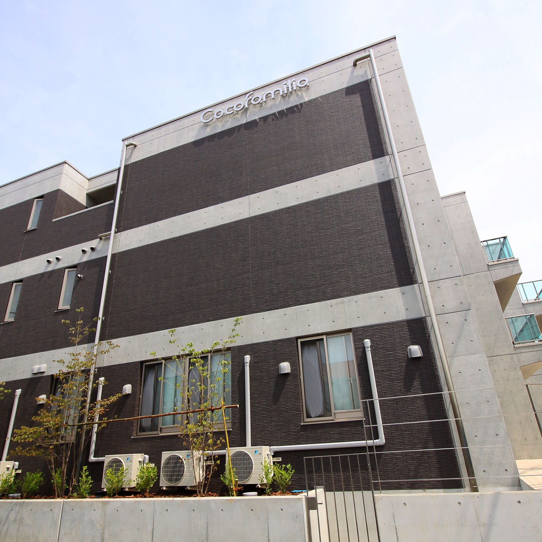
ネーミング開発、ロゴマークデザイン、ロゴアニメーション、名刺・封筒・パンフレット各種ツール、ウェブサイト制作等、ブランディングを担当。ココファミリア沼津は、高品質なサービス付き高齢者向け住宅です。2017年7月オープン。Cocofamilia(ココファミリア)は、静岡県沼津市にある介護・医療サービス付きのハイグレードな高齢者専用の賃貸マンション「サービス付き高齢者向け住宅」です。当社は、ネーミング(Cocofamilia)・タグライン(共に、心から、家族のように。)の開発、ロゴデザイン、広告デザイン、ウェブサイト制作等の総合的なブランディングに関するサービスを提供しました。
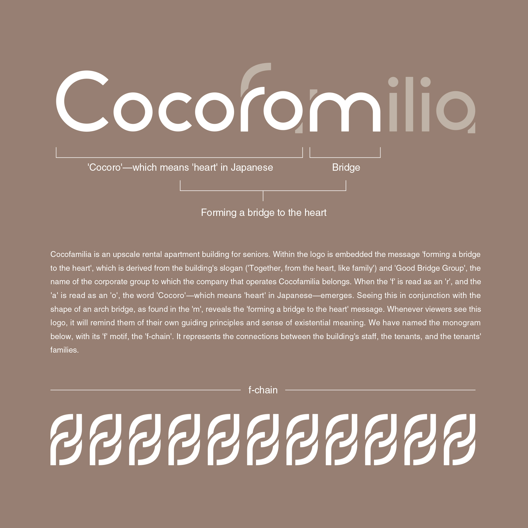
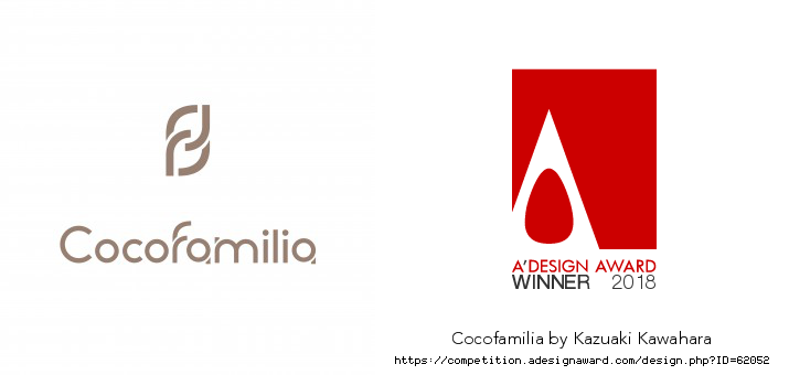
当社の開発したタグラインである「共に、心から、家族のように。」と、Cocofamilia(当社開発の施設名称)の運営会社が属する企業グループの名称Good Bridge Groupから導き出された「心の懸け橋になる」というメッセージをワードロゴに埋め込んでいます。
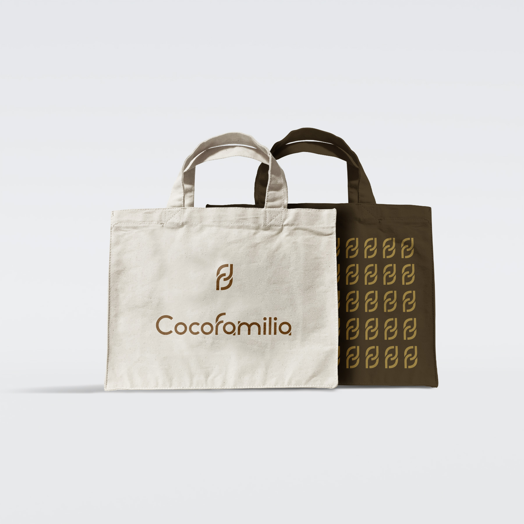
「f」を「r」、「a」を「o」として読むことで、日本語で心という意味のCocoroという言葉が浮かび上がります。「m」の中にあるアーチ橋の形状と組み合わされることで、「心の懸け橋になる」というメッセージを見出すことができます。このロゴを目にするたび、自分たちの行動指針や存在意義を思い起こさせてくれます。「f」をモチーフにしたモノグラムをf-chainと名付け、職員や入居者とその家族とのつながりを表現しています。
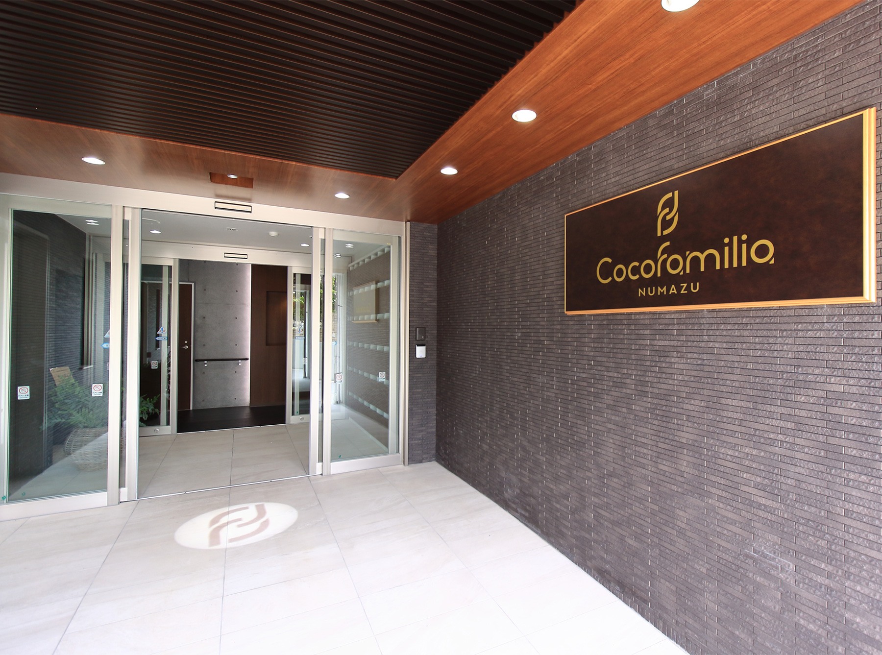
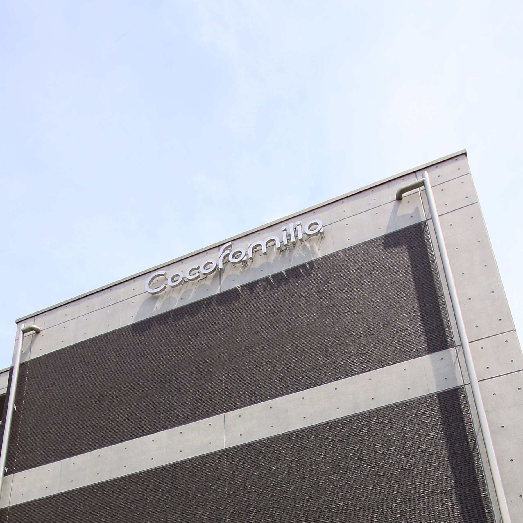
ロゴとVIシステムは、パンフレットや施設看板などの様々なツールで使用されています。ロゴに隠されたメッセージは、社内・社外を問わず高い評価を得ています。
他社の高齢者専用の賃貸マンションには低価格なものが多く、それとは一線を画す、高級感のあるデザインが求められました。このデザインでは、高級感と普遍性を感じられるデザインであることを前提に、隠れたメッセージを埋め込むことと、どのような場面でも利用できる耐久性や応用性とを両立させることが、最も困難な課題でした。最終的には、このような課題を全て解決することができたと考えています。
Client: ココファミリア沼津
Year: 2017
Cocofamilia is an upscale rental apartment building for seniors, with nursing and medical services. It is located in Numazu, Shizuoka Prefecture, Japan. We have provided Cocofamilia with services including name development, logo design, and advertising design.
Within the logo is embedded the message ‘forming a bridge to the heart’, which is derived from the building’s slogan (‘Together, from the heart, like family’) and ‘Good Bridge Group’, the name of the corporate group to which the company that operates Cocofamilia belongs. Whenever viewers see this logo, it will remind them of their own guiding principles and sense of existential meaning. We have named the monogram, with its ‘f’ motif, the ‘f-chain’.
Among other companies’ rental flats for seniors, many are low-priced, with low-quality services. In this case, we were called upon to provide a design with a high-quality sensibility that would draw a line between Cocofamilia and these other buildings.
Given that it needed to be a design that conveyed an upscale sensibility and a sense of universality, our biggest challenges were how to embed a hidden message within this design, and how to give it both the durability and the practical usability that would allow it to be used in any setting. In the end, we feel that we were able to solve all of these problems.